Everybody has their favorite example of how averages don’t really tell you what you want to know or how they are inappropriate for some situations. Most of these are funny because they apply averages to cases where single events are important. I’ll list a couple in the text boxes in this post. From the title:
If Bill Gates walks into a bar, on average, everybody in the bar is a millionaire.
Technically speaking, averages start with the assumption that deviations are due to random error, that is, that there is a kind of “true” value if we could only control things well — if there were no wind resistance and all balls were absolutely uniform, they would always fall in the same place; any spread in values is random rather than systematic.
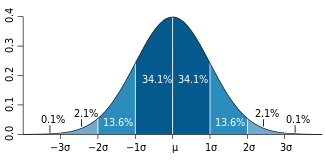
The familiar bell-shaped curve that illustrates the mean (average) value and deviations from the mean is referred to as the normal distribution or Gaussian or, in some cases, the similar but not precisely the same, Poisson distribution.
The distance marked σ (sigma) is called the standard deviation or SD and it is supposed to give you a feel for how the real points deviate from the mean. The area of the colored section in the figure shows the percentage of points that are one (dark blue) or two (lighter blue) SD away from the mean and what percentage of the points fall in that region. So, from the standard deviation, you can tell how reliable the data are: A low standard deviation means that the mean can be expected to be a reliable indication of what the actual data look like. A high standard deviation means that the data can be expected to be spread out.
The average resident of Dade County, Florida is born Hispanic and dies Jewish.
There are many examples demonstrating these kinds of distributions. The textbooks cite the blitz in London in WWII where the V-1 “flying bombs” were distributed in a characteristic random pattern. (“Aiming” was presumed due to fixed launch sites and fixed fuel; deviations came from wind resistance and other random factors). You can see a pretty good fit to the 3-D version of, in this case, the Poisson distribution.

On the other hand, Allied bombing of the German town of Aachen destroyed much of the city while leaving intact, the famous cathedral where Charlemagne was crowned. The joke was that the cathedral was unharmed because that’s what we were aiming at.
 It is generally assumed that what is good enough for bombing is good enough for the social and biological science. But is it? Going from the collection of individual points to two mathematical parameters, you obscure a good deal of information. A literally infinite number of different arrangement of points will give you the same mean and standard deviation. Even more important, are you really sure that your data is uniform, that is, as the statisticians describe, that they come from the same population. Getting to the point here, how are group statistics used in nutrition and medicine? The underlying principle is usually stated as the idea that “one size fits all.”
Three statisticians go duck hunting. A duck flies overhead.
The first statistician fires but the shot is a foot to the left.
The second statistician fires, but the shot is a foot to the right.
The third statistician says “got ‘im.”
Nobody loses an average amount of weight.
So averages depend on a uniformity in the population. But in diet, we don’t really believe that. Looking around at all the people who eat more than you do and gain less weight than you do is considered an anecdotal observation. (The fact that you don’t want to believe it adds some credibility). But there are experiments. David Allison’s group studied a group of identical twins, put them all on a weight reduction diet for a month and saw how much weight they lost. They calculated an energy deficit (differences in calories in and calories out) and compared that to the actual energy deficit, that is, weight loss minus food intake. The figure shows that pairs of twins were similar in energy deficit, but there was big variation between twins. The study was carried out in a hospital but given the possible random variations of 28 people over the course of a month, this is pretty good evidence for what is popularly called “metabolic advantage” (people below the solid line) or “disadvantage.” (people above). With this result about different folks, we’ll consider an example where group statistics may require some circumspection.

 Figure. 4 Relationship of estimated and measured energy deficit for 14 twin pairs (same numbers and color). Dotted line = regression of estimate on measured energy deficit; solid line represents identity. Subjects above solid line (of identity) are absolutely less efficient than those below. Data from Hainer, et al. Int J Obes Relat Metab Disord 2001, 25(4):533-537.
“Moderate Amounts of Fructose Consumption…”
To understand the limitations of groups statistics, consider a recent study entitled “Moderate Amounts of Fructose Consumption Impair Insulin Sensitivity in Healthy Young Men.” I will present a heavy-duty (ok, medium heavy-duty) analysis of this paper because it seems to have a scary message but in the end, it will turn out to be about not much. If you don’t want to go through it all, skip to “Is Moderate Fructose Bad.”
So, the trial compared responses to different sugar-sweetened beverages consumed over a period of 3 weeks, In the study, nine adults added beverages sweetened with either high levels (80 g/day) of glucose, fructose or sucrose (HG, HF or HS). A fourth group also consumed drinks with medium fructose (40 g/day: MF). The key measurement was insulin resistance. This was determined by administering labeled glucose ([6,6]-2H2-glucose means that the glucose was labeled at the sixth carbon with deuterium which can be detected by mass spectrometry) and testing with a euglycemic-hyperinsulinemic clamps. In this technique, insulin and glucose are infused continuously to keep blood glucose constant. Blood samples were collected every 5 minutes to follow the fate of the labeled glucose. The experiment was a cross-over experiment which means each participant got to try each of the different interventions.

Figure 5. Hepatic suppression of glucose production (%) after 3 weeks’ consumption of different sugar-sweetened beverages (HG: 80 g glucose/day,MF: 40 g fructose/day, HF: 80 g fructose/day, HS: 80 g sucrose/day). Redrawn from Aeberli I, et al: Diabetes Care 2013, 36(1):150-156. 
The primary data are shown in Figure 5. The figure indicates the suppression of glucose production from the liver; the normal response to glucose and insulin, as in this clamp experiment, is to repress the output of glucose (largely from glycogen). So, we are looking at a double negative — 100 % would be the effect of baseline; in the figure, lower is worse. HG and HF are in color because changes in these two groups constitute the key outcomes.
The height of the bars represents the means and the error bars, the standard deviations. The asterisk means that the high fructose (HF) group has significantly lower insulin resistance than the other groups. Now, right off, that sounds different from the title or, even more, different from some of the phrases in the paper :
“In conclusion, this study shows that, with regard to glucose metabolism and, specifically, hepatic insulin sensitivity, fructose, even in moderate amounts, seems to be more harmful than the same amount of glucose.” (My italics)
I usually describe this as “that which is not,” the phrase from one of the countries visited in Gulliver’s Travels because their language did not have a word for lying. This is actually pretty mild exaggeration or misdirection given the current state of fructophobia, so let’s take things at face value. Focusing just on HG and HF, the figure shows that, on average, high fructose is worse for insulin sensitivity. But is “average’ what you, as a consumer, want to know? Nobody is an average. What you want to know is if you switched from glucose to fructose what is the likelihood that things will really get worse. There are some methodological issues with this paper but this is an exercise in understanding data presentation. The problem here is that whatever the technical term “statistically significance” means, the fact that the error bars overlap means that at least some of the values for the HF group must overlap the HG group. Some may go up (get better) if you switch from high glucose to high fructose, although most must be going down. Is that because we are all pretty much the same and the ins and outs of daily life introduce randomness? Or are people really different and are the data telling you that you can’t be sure just who will benefit.
Bottom line: all statistics involves certain assumptions. Let me suggest that one reasonable assumption is that what we really want in a diet experiment is what are the odds of benefitting vs getting worse, that is, since I don’t know whether or not I am like the people in the experiment, what’s the chance that I will follow the trend or go the other way? Here, the experimenters could have answered the question because, remember, it was a cross-over design and individual responses could have been shown. But, they weren’t. Why don’t the authors tell us what the individual performance really was? They may think that they don’t have to. (Everybody else does it this way). They may have an inappropriately high regard for statistics. They may not want us to see the raw data. In any case, to give you an idea of what it could look like, I made up some data that would fit the statistical parameters. Let’s see if this tells us something about the limitations of group statistics.

Figure 6. Hepatic suppression of glucose production (%). Possible individual data that would be consistent with mean and SD for HF an HG in Figure 5.
There are, in fact, an infinite number of different arrangements of responses of individuals that would account for the difference in mean and standard deviation but I picked a bunch by trial and error to fit the mean and standard deviation. Shown in Figure 6A above, you can see that you could get a good fit if more than half of the points in the HG and HF group were the same. In fact, you could pick numbers such that everybody except one person in the high glucose pattern had behavior outside of the range of the fructose group. Now, if that were the real data, it might be okay. One might be willing to stay on HG since half of the HF people were lower than all but one of the HG people. Still, it’s not clear-cut and it has lost some of what one might expect of “statistical significance,” which as Wikipedia puts it, is “so extreme… that such a result would be expected to arise simply by chance only in rare circumstances.”
Change in the means doesn’t tell you what happened.
Figure 6A doesn’t tell the whole story. Just as there were a lot of ways of having the mean and standard deviations reported, there are many possible results for different ways to go from HG to HF. Again, you can’t tell from group statistics. In fact, this was a cross-over experiment and they are the same people. So, did half of them really stay the same? We don’t know. One possible outcome that you could make up is shown in B. Think of this as what happens when you replace glucose in your diet with fructose. Four subjects lost insulin sensitivity (red arrows) but four of them (green arrows) went up, that is, they would be worse off staying with the glucose. In sum, the risk may be greater in adding the fructose but it’s not as clear cut as the group statistics suggest. This applies as well to the comparisons were there were no change. Did everybody stay the same or did some go up and some go down? Bottom line: you just can’t put much stock in this kind of group statistics.
Is moderate fructose bad?
The analysis above shows that group statistics hide a lot of information and that’s my point but, as long, as we’re talking fructose, it would be good to see what is really being said. When you look at the comparison of the high glucose group with baseline, it is surprising. The stated objective of the study was to see “the effect of moderate amounts of fructose and sucrose compared with glucose…” but how about glucose itself. The data show a 70 % suppression of hepatic production in response to glucose-sweetened beverages compared to baseline. But the baseline, according to the paper, actually had more fructose, but insulin sensitivity was better. In other words: If you lower fructose,things are 30 % worse? How is this possible? This is opposite to the conclusion of the paper. One thing that was different was that there was slightly higher total carbohydrate in the HG group, Maybe, even a small amount of total carbohydrate affects insulin resistance. However, the MF group is just as low as baseline. The most likely explanation is that fructose looks worse because statistics say so and that the data are simply not good enough to find differences between the effect of fructose and the effects of glucose if there are any.
But here’s a thought: what would happen if you took out some of the carbohydrate from all of the diets and added fat in its place and, now, let folks drink the sugar-sweetened soda? Here’s a prediction: you wouldn’t need any group statistics. Everybody would get better because of the carbohydrate reduction. Just a guess.

This is nothing to do with your main point but the statistics of the flying bomb impacts on London caused deep soul-searching within the British government of the time. To understand what followed, it must be realised that ALL (not some, not most but ALL) German agents in the UK were actually working for the British through what was called the 20 Committee (20=XX in Latin, XX= Double-Cross !) and these agents asked by the Germans to report the fall of the V1’s in London. The British realised that if they gave fake reports of V1 impacts and that they were actually over-shooting central London, the Germans would shorten the range to compensate but the V1’s would then, in reality, fall to the south of London in a much less heavily populated area.
The soul-searching came about because some British ministers considered this to be “playing God” ….
I’m afraid that’s what you do in war. Unfortunately, in dealing with evil, it comes down to the old joke about the farmer with the beautiful plot of rows of vegetables and flowers. A priest walks by and says to the farmer: “that’s a beautiful farm you and God have created.” The farmer answers: “Why, thank you. But you should have seen it when God was working it all by himself.”
Excellent easy to understand illustrations of how statistics are used to mislead and gain support for possibly fictional ideas. On balance one may argue the use of statistics has done more harm than good since many have found the use of statistics an easy way to fool us into believing their work is other than what it would otherwise appear. In addition to misuse used to create false conclusions there is another category, fictional statistics based upon on data that never existed. Such claims for example may take the form “Well known statistics indicate consumption of saturated fat causes cardiovascular disease”. They may be well known but the data on which the statistics are supposed to be based lies only in the imagination of those making the claim: another case of that which is not?
All of nutrition rests on the healthy low-fat, high-fiber diet that has reduced heart disease and diabetes in the group that was assigned to follow it. This study is what they call in IT, “vaporware.” I think, luckily it is fading back into the miasmal mist from which it arose.
Do you mean g/day rather than mg/day in the HF/HG data?
it would be interesting to run a fructose experiment with a piffling mg/day difference to see if it generated statistics that could be used to write a peer-reviewed paper.
I’m guessing that, in the current climate of fructophobia, it would.
Fixed. There is definitely a difference in low fructose and high (the problem with fructophobia) but mg might be pushing it.
Dear Dr. Feinman,
Change in the mean does equal the mean of the change (when considering absolute changes).
In the case of relative changes, however, this is not true, IOW: relative change of the mean isn’t necessarily the same as the mean of the relative change.
This study looked at percentage of hepatic suppression, so the most logical statistical analysis is to look at the absolute change of percentages. If you do that: calculating mean of change and change of mean, will give you the exact same result, no matter in what way the datapoints are connected.
Regards, Celine
Quite right. I will fix that. What I was getting at, though, was that the change of the mean hides the effect of the individual trajectories. In any case, there is no reason not to show individual responses, especially since they set it up as cross-over experiment. The real problem though is what I mentioned at the end that the baseline diet was higher in fructose than the HG yet was better. So the real problem is that there was no null hypothesis. Fructose was going to be bad no matter what.
The weight curves on a lot of studies I’ve seen have a sharp initial drop followed by a slow retrace. But those are averages of a group of people. Take a look at my weight & ketosis vs time plot and it’s a lot more up and down, but the weight loss is strongly correlated with the ketosis. For a person wanting to understand what to expect on a diet, being able to see many individual trajectories would be much more informative.Here’s one: http://deadhat.blogspot.com/2013/01/ketosis-vs-weightloss-lets-do-numbers.html
Very impressive data collection. Of course, critics would say that it is well known that both parameters, ketosis and weight loss are consequences of hypoenergetic input. You might get together with Jimmy Moore. Possible creation of JONEO, Journal of N equals one.
If they accused me of being on a hypoenergetic diet, they would be wrong. I have a desk job. I get little exercise while the weather is horrible. I eat a high fat, low carb diet with lots of cream, eggs, meat, cheese and other yummy things. I don’t count calories. From my graph you can see that I’m not a perfect adherent to the diet, mostly to do with overwork and a horrible work canteen. It would be nice to be able to do energy accounting so I could do a multivariate analysis, but I don’t think that’s feasible, especially as I’m not a mouse.
Still, very impressive n-=1 study.
Dear Dr. Feinman,
I got the point and it’s a valid one. You could still rescue some of the lost data by determining upper and lower bounds of the variance of change (for all possible bijections). To do that, you only need to look at two bijections of the datapoints, namely: one that’s order-preserving (monotonically increasing) and one that’s monotonically decreasing.
This way, assuming Gaussian distribution, you could still say: the chance of getting worse when switching from HG to HF, is between X% and Y%. The fact remains that X% and Y% will both be greater than 50% though.
I just wished people stopped calling out on “fructophobia”, this reminds me of linguistic tricks normally used in magazine articles. I don’t mean any disrespect, it’s only a difference in style.
Kind regards, Celine
Your suggestion is right and it is one way to “… rescue some of the lost data by determining upper and lower bounds of the variance of change (for all possible bijections).”
But we have to ask: rescue from what? The data is there. Why not plot it. I still adhere to the golden rule quoted in previous posts, (e.g.A Guide to Flawed Studies.).
“The important point…is that the onus is on the author to convey to the reader an accurate impression of what the data look like, using graphs or standard measures, before beginning the statistical shenanigans. Any paper that doesn’t do this should be viewed from the outset with considerable suspicion.”
Showing the primary data does not prevent any statistical shenanigans. On comparisons, we suggested a matrix demonstration which, while it over-emphasizes possible variation, give the reader a chance to apply the eyeball test . All of these statistical manipulations and especially the min-numbing epidemiology studies — only the computer knows for sure what is going on.
On “calling out on ‘fructophobia’,” I am not sure what to do. Even as professor, teaching medical students, I have to address studies or opinion pieces that get wide appeal but not only don’t meet minimal standards of science but are borderline fraud, some of which have chalk dust from stepping on the line if not crossing it. “Fructose is metabolized by the same mechanism as ethanol.” I would not accept that from an undergraduate but insofar as I have a larger educational goal, I have to address it. It is not part of science, really but is the new official diet. There is lots of nonsense in magazine articles that I can simply ignore and lots of serious biochemistry that I think is wrong and can be approached on a professional basis but I am not sure how to deal with fructose.
Interestingly, I am sure that I am not the only one, but I invented “lipophobia” which I only used in conversation. Mike Eades started using it and he admits that he got it from me. Then Michael Pollan used it without any sense of irony and I started referring to “lipophobia as Michael Pollan calls it” but nutrition has gotten even worse in the last few years and it seems unnecessary.
I grew up in Brooklyn — as did Lustig, give him credit he can take it as well as dish it out — so I have no problem with disrespect. Open to suggestions. The real threat of what we used to call Fructophobia is that we will never find out what the real importance of fructose is in the diet, what really goes on in metabolism and what the limits are for human nutrition.
RDF
I recall papers by Gerald Reaven, among others, which plot individual responses. The results are very interesting – there’s a general trend, the magnitude of which varies significantly between individuals, and some serious outliers which zing off in a different direction. Nutrigenomics/pharmacogenomics may one day take over from the current Herd Management protocols of “Evidence Based” Medicine, pity such analysis went out of favour in exchange for the latter.
My take on fructose is that like many things there’s a J curve – anatomically correct (small) quantities are harmless or maybe even beneficial, the danger comes from excess. Drinking a glass of water good, falling in the sea bad . . .
A crossover study AND individual data reported? That’d be a treat. You’ve set the bar very high, Dr. Feinman.
I’m removing the bar. They did the cross-over experiment. That’s the hard part. They just have to plot the data. Simple graphing program. Takes more steps to calculate the statistics.
[…] Richard Feinman: If Bill Gates walks into a bar, on average, everybody in the bar is a millionaire. […]
[…] Richard Feinman: If Bill Gates walks into a bar, on average, everybody in the bar is a millionaire. […]
[…] state is one of equanimity (neither pain nor pleasure). Unfortunately, much like the Bill Gates bar joke, the average state remains a theoretical construct and the swings between pleasure and pain […]